Leveraging location: Place lies at the heart of who we are as people, so why not our brands?
Place and its sentimentality lie at the heart of who we are as people, so why not our brands, asks Henry Brown?
Written by Henry Brown
Originally published in FMCG CEO magazine
Every brand starts somewhere, and those beginnings influence the values and purpose of that brand, even as it grows and expands. Yet for many, where the company or business is based or started out is barely acknowledged in their brand identity.
But they are missing a trick, because leveraging place into brand identity is an incredibly powerful tool. Some FMCG brands already know this – usually found in the food and drink sector – but not enough. They could be using techniques that destination brands already know are invaluable for attracting and retaining customers. It’s an opportunity to leverage existing values and to tap into communities that, for many, already exist for the benefit of the brand.
The possibilities here are almost limitless and it can work for luxury brands just as much as more everyday ones. For example, Yorkshire Tea uses place in more than just its name. It taps into a warm community feeling: from bringing onboard brand ambassadors that are proud Yorkshire folk – such as Sean Bean and Michael Parkinson – to its use of undeniably pleasant imagery of the rolling countryside, they brilliantly capture that warm, bucolic feel of Yorkshire.
At the higher end, brands like the champagne-makers Veuve Clicquot have done well to use place. They offer gift boxes with a detachable arrow that could be customised with any destination, which then shows how far it is from Reims, the unofficial capital of the Champagne wine-growing region. It cleverly links somewhere of importance to the buyer to the brand’s home.
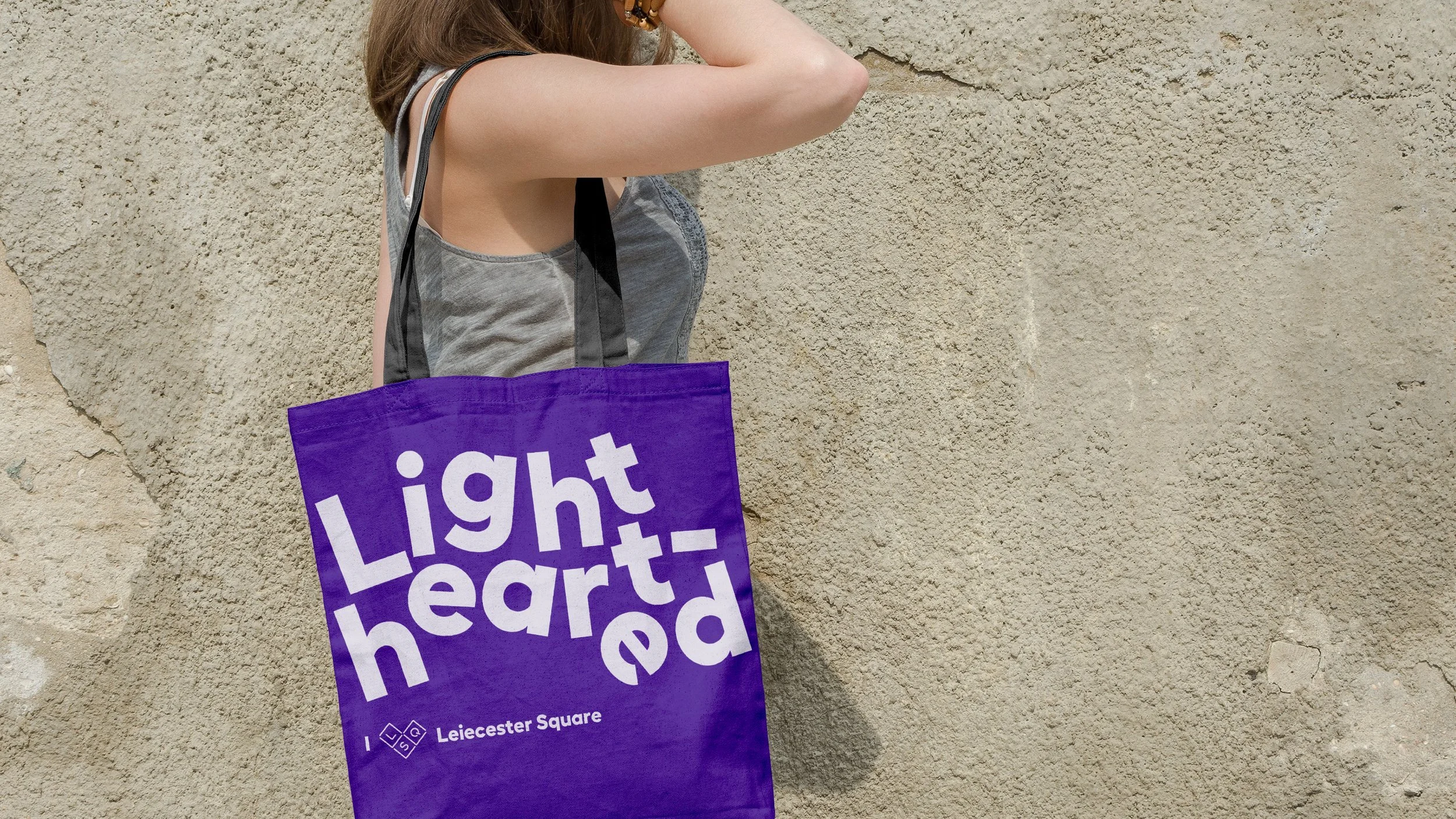
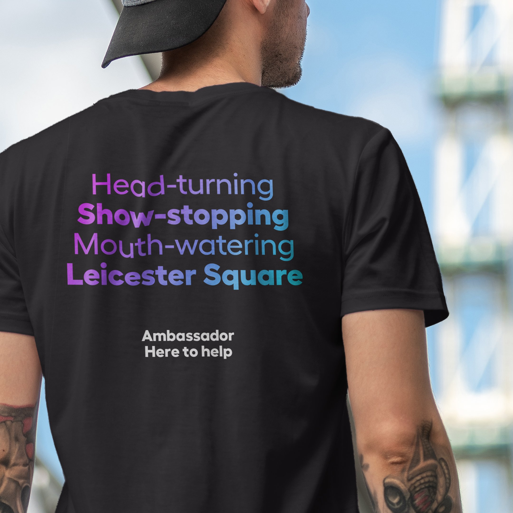
Branding Leicester Square as a destination that exists to entertain
Embrace authenticity
To do this well, as any successful destination brands knows, means embracing the truth of a place. You cannot a lie about an area, people will quickly work out when they arrive that they’ve been sold a false promise.
When Lantern worked on the rebrand of Leicester Square, we could easily have tried to present it as an upmarket area – it does have some luxury hotels – but that’s not the truth of it. It’s unrefined and unapologetically bright and bold. Londoners know that, and international visitors would see it as soon as they arrived. Instead, the campaign focused on the entertainment and excitement of the area, elevating that authentically is what made it successful.
Soapsmith, which creates fragrances for their products inspired and named after London areas, understands this. Its Camden scent is inspired by the spices, incense and exotic foods found in the markets, while its Hackney is inspired by the “grassy and herbaceous marsh lands” of the area. Visually, it uses colours and architectural textures and shapes to create vibrant collages for the packaging that represent the areas they’re named after.
It’s about knowing the place and being authentic, rather than trying to leverage place into the brand simply because it feels like a good idea.
Patagonia: Using place to sell a mindset
Strong and Northern: When a product is embraced by a place
Proper Brew: Yorkshire Tea is a brand that nods to local language
Visual cues: Leaning into the characteristics of a place visually
Understanding the community
In place branding, engaging and speaking to the local community, whoever they are, is key. The community understand the value of a place better than anyone. For FMCG brands, this means understanding your original audience, as well as your target audience. It means knowing who they are beyond demographics like age or gender, instead it’s about understanding and speaking to a mindset.
A brand like Patagonia does this well: customers might not be envisioning the wilds of Patagonia while buying a t-shirt, but they are buying into a mindset of nature, exploration, and conservation, leveraging the very essence of the place.
This was front and centre for us on a recent project for Visit Estonia. We travelled to the country to experience first-hand the nation’s culture, including discussions with the country’s best restauranteurs and bog-shoeing with a nature lover. This led us to position Estonia as an experience-first destination: the universally appealing story was primarily driven by our understanding of the community.
Another Yorkshire brand, Henderson’s Relish, fully understands its place of origin and proudly embraces its cult status as a symbol of the city of Sheffield. The tagline ‘strong and northern’ applies to both the product and the community. The packaging has scarcely ever changed but it produces special edition bottles featuring phrases and slang synonymous with Sheffield, such as “Reyt good on ‘Owt”, and the Arctic Monkey’s special edition bottles, leveraging that local love into their brand.
Engaged and vibrant communities are the gold-dust that most place-brands are looking for. This loyal and captive audience can become both brand ambassadors and long-time customers, and FMCG brands can do it too.
It takes attitude
Channelling the attitude of a destination is essential if brands want to capitalise on place. Verbal cues like those used by Henderson’s, as well as Yorkshire Tea’s taglines like “proper brew” are a key element in effective place branding. This can be done through storytelling, messaging, as well as tone of voice. The verbal needs to cut through: brands need bold headlines that stand out but also create familiarity.
The verbal attitude needs to complement a bold and engaging visual identity. A great example of using place effectively in the visual style is Brooklyn Brewery. When you think of Brooklyn you think of creativity, craft, and being open and bold, and the beer brands embodies the spirit of the borough. The logo was initially designed by Milton Glaser who did the I heart NY logo – someone who knows the power of place-branding – but everything from the photography to illustration to big shouty typography and light -hearted tone-of-voice links to Brooklyn’s attitude.
Don’t ignore the spark
There are many brands who nod towards place but fail to express why its relevant or are miss what makes a place so special. One example of this is St Austel Brewery. This is a brand that should ooze Cornish lifestyle and reflect that easy-going feeling of the region. Instead, delicious as it is, its brand looks like almost every other local brewery. Beyond the name there is nothing else there to back up the sense of place. Another is HP sauce: how many people don’t realise that it’s named after the Houses of Parliament?
Similarly, most Scottish whisky brands capitalise on the place they are distilled. However, beyond their names, their brand identities are often indistinguishable. Whisky lovers will tell you how much variety and differentiation in flavour there is between different whiskies. So why do the majority all look the same? They often fall back on the traditional symbols of Scotland – a thistle, a stag, or the highlands – and these unique products end up looking very similar. Each distillery and the region it is based in have distinctive heritages and landscapes. There’s a big opportunity here for a Scottish whisky brand to stand out by celebrating the place and its attitude in an individual and bold way.
Harnessing the values of a place is a subtle way of building trust into a brand. Ikea, for example, embodies the Swedish and Scandinavian lifestyle and mindset. Colour is an obvious visual cue here, being blue and yellow, but language plays a huge part. The simple, short headlines reflect Sweden’s no-nonsense (but sometimes cheeky) approach to life. It also reflects the modern, clean and minimal Scandi aesthetic that is evident in their products. Just through a headline on a blue or yellow background, you would recognise an Ikea advert. By harnessing these shorthand cues, Ikea doesn’t need to invest considerable time and resources into building a story and narrative from scratch. They simply leverage the positive international image of Sweden and perhaps more broadly Scandinavia, into their brand.
If FMCG brands recognise the power of place in this way, and honestly and authentically leverage it into their branding, the sky is the limit.


